Five Colors Blind the Eye: The More Vivid the Home, the Tired the Brain | XERLIFE+ Journal
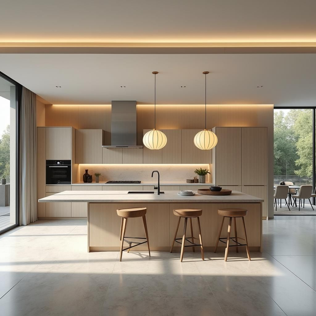
你有没有走进过一个色彩浓烈的空间——红墙、彩砖、跳色的沙发——第一眼觉得热闹,待久了却莫名烦躁,甚至想逃?而住惯了大白墙的人,走进那样的空间,第一反应往往是:想回家。
问题不在审美,在于你的大脑。
《道德经》第十二章说得直接:”五色令人目盲,五音令人耳聋。”颜色太多,眼睛反而看不见;声音太杂,耳朵反而听不清。老子在讲欲望,也在讲感官的真相:刺激不是越多越好,过了量,人就”瞎”了。这句话不是劝人戒色,是提醒我们:感官是有额度的。
神经科学完全支持这个判断。视觉是大脑皮层消耗资源最大的感官之一——你”看见”的每一抹色彩,都要经过层层处理:辨色、认形、判断意义。高饱和的鲜艳色彩是强刺激,让大脑持续保持高唤醒;研究普遍发现,长时间身处高饱和、高对比的环境,认知负荷明显升高,人更容易疲劳、易怒、注意力涣散。而低饱和的灰调与大地色信息量小,大脑处理起来几乎不费力。颜色越简单,留给思考和感受的带宽就越多。
换句话说:颜色从来不只是装饰,它是大脑每天要交的”处理费”。家里每多一种鲜艳色,大脑就多付一份税。
怎么设计一个低熵的家?三个手法:
第一,制定低熵色彩计划。全屋主色不超过三四种,全部取自大地色系——土褐、米白、燕麦、鼠尾草灰。它们饱和度低、彼此相近,大脑处理起来只是”一笔小账单”。
第二,鲜艳色只做”药引”。跳色可以留,但只留给一个小抱枕、一幅小画、一盆花——小到可以忽略,又大到能点亮心情。让鲜艳成为惊喜,而不是背景噪音。
第三,慎用大面积高饱和墙色。刷墙前问自己:这个颜色,我的大脑要看它二十年,付得起这笔长期处理费吗?
五色令人目盲,反过来说:少色,令人清明。家不是画廊,不必每面墙都争着说话;把颜色省下来,就是给大脑留带宽。
你的家不是用来看的,是用来养你的大脑的。
Have you ever walked into a space of intense color — red walls, patterned tiles, a sofa in a clashing shade? The first glance feels lively; stay a while and you grow inexplicably irritable, even wanting to flee. And people used to plain white walls often have one first reaction upon entering such a space: wanting to go home.
The problem isn’t aesthetics — it’s your brain.
Chapter 12 of the Tao Te Ching says it bluntly: “Five colors blind the eye; five tones deafen the ear.” Too many colors, and the eyes see less; too many sounds, and the ears hear less. Laozi was speaking of desire, but also of a truth about the senses: stimulation is not the more the better — past a point, people go “blind.” This line isn’t urging abstinence; it’s reminding us that the senses have a quota.
Neuroscience fully supports this judgment. Vision is one of the most resource-hungry senses of the cerebral cortex — every color you “see” passes through layers of processing: distinguishing hue, recognizing form, judging meaning. High-saturation vivid colors are strong stimuli that keep the brain at high arousal; research consistently finds that prolonged time in high-saturation, high-contrast environments raises cognitive load markedly, making people more fatigued, irritable, and distractible. Low-saturation grays and earth tones carry little information — the brain processes them almost effortlessly. The simpler the color, the more bandwidth remains for thinking and feeling.
In other words: color was never merely decoration — it is a “processing fee” the brain pays daily. Every extra vivid color in the home is one more tax.
How do you design a low-entropy home? Three techniques:
First, make a low-entropy color plan. Limit the whole house to three or four main colors, all from the earth family — clay brown, off-white, oatmeal, sage gray. They’re low in saturation and close to one another; for the brain, processing them is just “a small bill.”
Second, use vivid color only as a “catalyst.” Accent colors can stay — but only for a small throw pillow, a small painting, a potted flower: small enough to ignore, big enough to lift the mood. Let vividness be a surprise, not background noise.
Third, be cautious with large areas of high-saturation wall color. Before painting, ask yourself: my brain will look at this color for twenty years — can it afford this long-term processing fee?
“Five colors blind the eye” — conversely: fewer colors, clearer mind. A home is not a gallery; not every wall needs to speak at once. Saving on color is reserving bandwidth for the brain.
Your home is not for looking at — it is for nurturing your brain.