Softening Light with Dust: Why Some Homes Rest Your Eyes and Others Tire Them | XERLIFE+ Journal
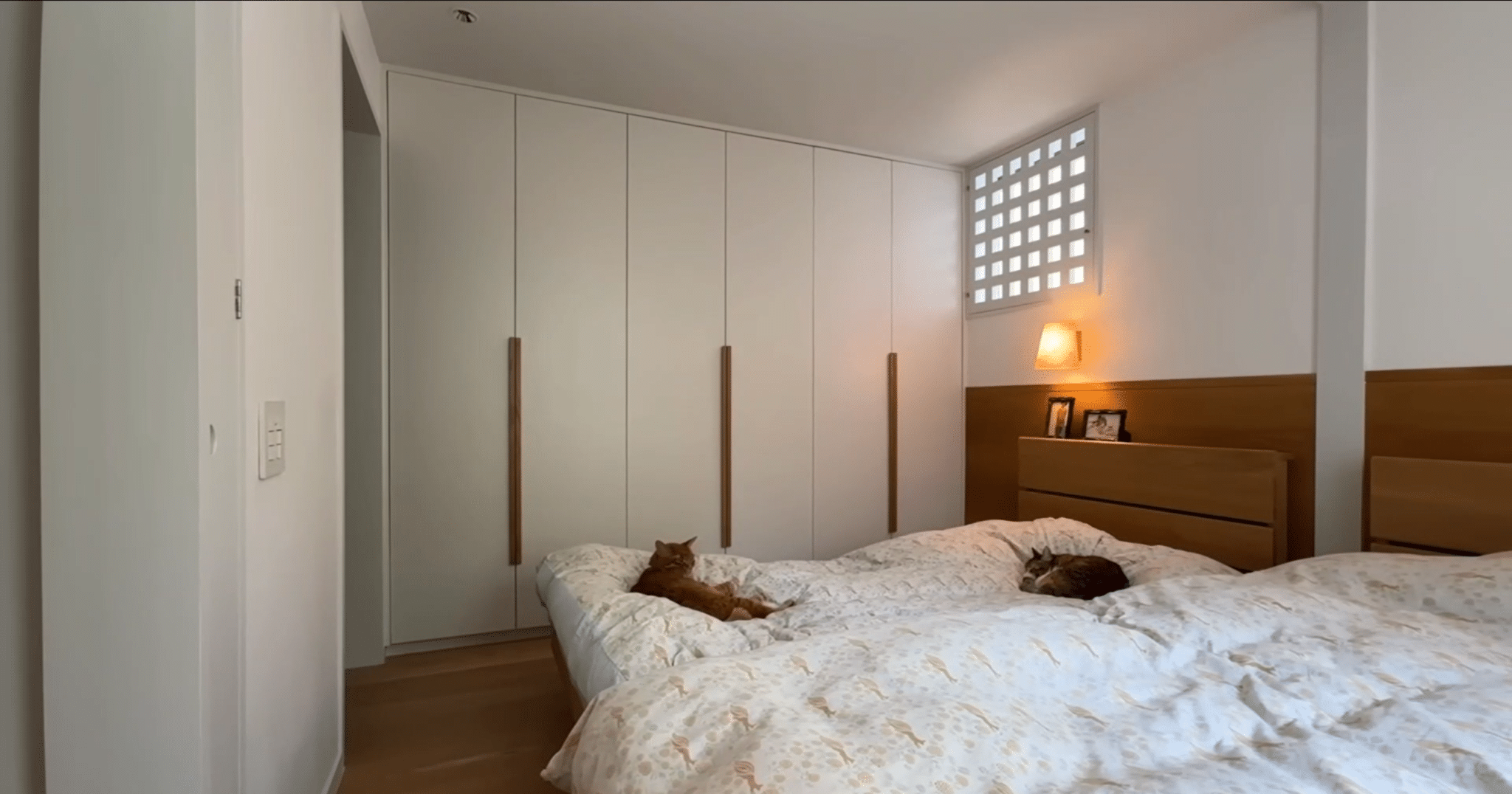
你有没有这种经验:走进一个家,家具很贵、颜色很艳、处处是重点,可待了半小时就觉得眼睛累、心里躁,坐立不安;另一个家说不上哪里好,就是安安静静的,一坐下就不想起来,连说话都变慢了。同样待一下午,一个家像上班,一个家像度假。
差别不在钱,在颜色的”态度”。
老子在《道德经》第五十六章说:”挫其锐,解其纷,和其光,同其尘。”意思是:挫掉锋芒,解开纷扰,调和光芒,混同于尘世。四个动作,说的是同一件事——别让自己太”扎眼”。放到空间里,就是颜色别太”扎眼”。
为什么扎眼的颜色费眼睛?因为视觉系统处理高对比、高饱和的刺激,需要调动更多资源,大脑的唤醒水平也会被持续拉高。研究普遍发现,高对比度的环境会让视觉系统长期处于紧张状态,视疲劳、烦躁感随之而来;而色彩和谐的空间,视觉处理更省力,人更容易放松。这就好比听音乐:连续的高音轰炸让人神经紧绷,平稳的旋律才让人坐得住。颜色是眼睛的旋律,家里的颜色一直在响,你的眼睛就一直在工作。眼睛是大脑的第一入口,眼睛累,大脑就跟着累;眼睛松,大脑也跟着松。
那怎么做到”和光同尘”?记住四个手法。
第一,用低饱和大地色系打底。米白、浅灰、陶土、亚麻色,它们不抢注意力,像背景音乐一样托住整个空间,让眼睛有地方”靠”。
第二,同色系做深浅过渡。想要层次感,别用”撞色”,用同一个色相的深浅:浅米色的墙、中米色的沙发、深棕色的地板。颜色之间像同一首歌的不同音高,过渡顺滑,层次有了,眼睛也不累。
第三,材质统一。木、麻、陶、棉,天然材质自带色温,统一使用,颜色再杂也乱不到哪去,空间的”气质”反而更稳。
第四,大面积极简,亮色点睛。抱枕、花瓶、一幅画,可以用一点亮色当”眼睛的休息点”——注意,是休息点,不是聚光灯,一处就好,多了就是噪音。全屋有一两个亮色就够了,剩下的交给大地色慢慢说。
老子的”和其光”,是不与万物争辉。你的家也一样:颜色不争,眼睛不累,心才不烦。高级感从来不是颜色多,而是颜色”让”。让出来的地方,眼睛才敢放松。颜色一让,人就想住下来。
你的家不是用来看的,是用来养你的大脑的。
Have you ever walked into a home where the furniture was expensive, the colors vivid, every corner a focal point — yet after half an hour your eyes ached, your mind felt restless, and you couldn’t settle? And another home that you couldn’t say what was good about it, just quietly comfortable — once you sat down you didn’t want to get up, even your speech slowed. Spend the same afternoon in both: one feels like work, the other like vacation.
The difference is not money — it’s the “attitude” of the color.
In Chapter 56 of the Tao Te Ching, Laozi says: “Blunt the sharpness, untangle the knots, soften the glare, mingle with the dust.” Four actions, one message — don’t make yourself too “eye-catching.” Applied to space: don’t make your colors too “eye-catching.”
Why do glaring colors tire the eyes? Because the visual system processing high-contrast, high-saturation stimulation must mobilize more resources, and the brain’s arousal level is kept persistently elevated. Research consistently finds that high-contrast environments keep the visual system in a state of sustained tension, bringing visual fatigue and irritability; while color-harmonious spaces are easier on visual processing, and people relax more readily. It’s like music: a barrage of continuous high notes keeps the nerves taut; a smooth melody lets you sit still. Color is the melody of the eyes — if the colors in your home keep playing, your eyes keep working. The eyes are the brain’s front door: tired eyes, tired brain; relaxed eyes, relaxed brain.
So how do you achieve “softening the light, mingling with dust”? Remember four techniques.
First, build a base of low-saturation earth tones. Off-white, light gray, terracotta, linen — they don’t compete for attention; like background music, they hold the whole space and give the eyes somewhere to “lean.”
Second, create depth within one color family. For layering, don’t use clashing colors — use light and dark shades of the same hue: light beige walls, mid-beige sofa, dark brown floor. Colors relate like different notes of the same song — smooth transitions, real depth, and eyes that don’t tire.
Third, unify materials. Wood, linen, clay, cotton — natural materials carry their own color temperature. Used consistently, even mixed colors stay coherent, and the space’s “character” becomes steadier.
Fourth, keep large areas minimal, add bright accents sparingly. A throw pillow, a vase, a painting — a touch of bright color as a “rest point for the eyes.” Note: a rest point, not a spotlight. One accent is enough; more becomes noise. One or two bright spots for the whole home, and let the earth tones do the rest of the talking.
Laozi’s “soften the light” means not competing with the brilliance of all things. Your home is the same: when colors don’t compete, eyes don’t tire, and the heart doesn’t fret. Sophistication was never about having many colors — it’s about colors that “yield.” Where they yield, the eyes dare to relax. When colors yield, people want to stay.
Your home is not for looking at — it is for nurturing your brain.